Applying Color Theory To Your Custom Logo Stencils
Once you created the perfect logo for your business, you probably thought the work was over until you picked up your custom stencils and realized that you didn’t know what colors to use. Since you went through all of the effort to design the logo and have custom logo stencils made, you should take the time to really understand the concept of color theory and how the psychology of color can have a huge impact on your brand.
WHAT IS COLOR THEORY?
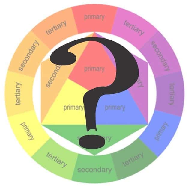
In a nutshell, color theory explains how the human brain perceives and responds to color. On the surface, that might not sound like much, but it is actually a very nuanced and interesting science. Color theory also helps explain how colors can communicate unconscious messages to consumers and the various ways colors can be mixed and matched.
As a business owner, color theory is something you should take into consideration not only with your logo but with every aspect of your brand, website and storefront.
THE BASICS
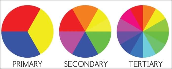
Almost everyone has seen a color wheel before. There are three main sets of colors, and every shade is created from these palettes.
The first, and most basic, color wheel includes the primary colors of red, yellow and blue. The secondary color wheel mixes each of the three primaries to create orange, green and purple. The final, most complex color wheel includes the tertiary colors, which are what happen when you mix a primary and secondary color together. These colors include blue-green, red-orange and red-violet.
Now that you understand the basics of mixing colors, the next step is to understand how colors can work together.
WORKING IN HARMONY
When you think “harmony,” you probably think of music. Color harmony is a similar concept that involves creating a visually pleasing arrangement of hues in order to attract the eye of your target audience.
The idea of color harmony is not as straightforward as only mixing colors that “go together,” though. The brain is picky about visual stimuli: Something that matches too much is dismissed as boring while something with too many colors repels the eye and it labeled too erratic. When choosing a color scheme, it’s important to achieve the right balance.
This can quickly get overwhelming, as there are dozens of ways to create harmonious color schemes. To keep it simple and relevant to business, here are three formulas that you can follow.
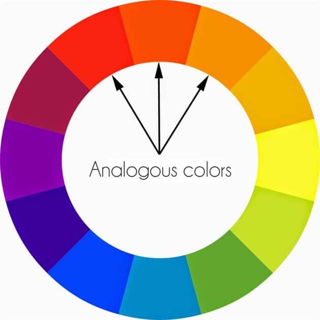
1. Analogous colors – This simply means a color palette using shades that are similar, such as blue, blue-green and green. This scheme is great for projecting a calming, grounded feel.
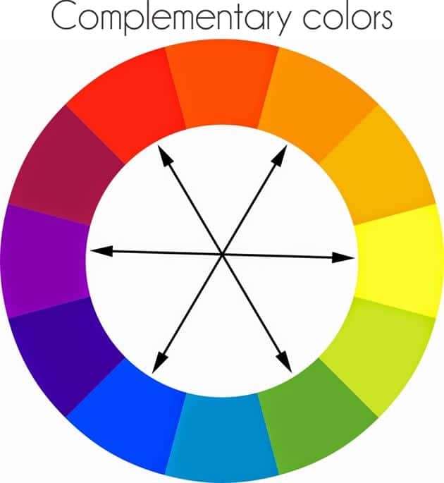
2. Complementary colors – Complementary palettes utilize the tertiary color wheel to find colors that are directly opposite from each other, such as yellow and purple or orange and blue-green. This is the safest option for creating visual stability and harmony.
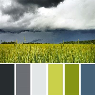
3. Natural colors – This one is a bit more advanced because it draws color schemes from nature. It isn’t always readily apparent that these colors should go together just by looking at a color wheel, but if done correctly, it creates an extremely interesting and harmonious palette.
THE PSYCHOLOGY OF COLOR
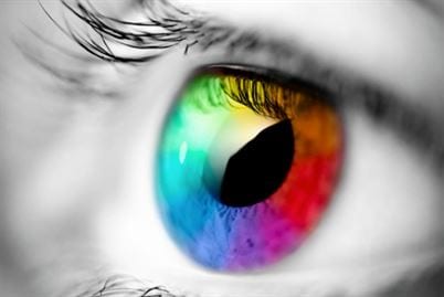
There are many studies about how colors affect the human brain and how colors in branding affect consumer choices. The human perception of color can also change based on the culture of your target demographic, so this is something to bear in mind if your business is targeting diverse audiences or has an international presence.
While specific feelings are too subjective to be accurately attributed to colors, color perceptions are definitely tied to certain basic emotions.
For example, there is a study called “Impact of Color on Marketing,” in which the researchers found that almost 90 percent of immediate opinions on a variety of products were formed based on color alone. A similar study also found that consumers are affected by the perceived “appropriateness” of a color scheme. If the colors didn’t properly “fit” the product, it was immediately less appealing.
With a seemingly endless number of factors to think about, you might be wondering how you can possibly pick the ideal color combination for your brand. As it turns out, this has also been studied, and the results can help business owners tremendously when it comes to selecting brand-appropriate coloring.
BRAND PERSONALITY

Jennifer Aaker, a Stanford psychology professor, has extensively studied the “right” ways to select colors that fit the purpose and intended feel of your product. She wrote a paper titled “Dimensions of Brand Personality” that outlines five major categories that every product will more or less fall into.
The five basic qualities of brand personality are:
1. Sincerity – These brands want to project an honest, wholesome, cheerful, friendly, inviting or family-oriented feel. Baby products and family-oriented businesses typically project these feelings. These colors are usually blues and pastels though greens and yellows can be used as well.
2. Excitement – Products that aim to be trendy, young, imaginative, contemporary or daring fall into this category. Many start-up businesses seek to convey these emotions. Bright colors like pink, orange or gold are a few examples.
3. Competence – This is a trait of brands that want to project reliability, success, intelligence, security or technical skill. Finance corporations are a good example of this, as they often use “serious” colors like burgundy, deep green and cream.
4. Sophistication – Luxury brands that want to convey glamor, charm, beauty and femininity employ color schemes to evoke this feeling. Dark purple, black and jewel tones are traditionally used to create a luxe impression.
5. Ruggedness – Sporting goods stores and construction companies will use this color association to project masculinity and toughness. Yellows, oranges, reds and browns are most often used for this.
Ultimately, there is not a single, clear-cut right or wrong color palette. Consider the most important feeling you want your brand to convey, and then think of brands that evoke similar feelings for you as a consumer. Take note of any recurring color schemes across the brands, and you will have an excellent starting place for crafting a perfectly color-coordinated logo.
Once you’ve found the perfect palette for your business contact Stencils Online to have your custom stencils made and start branding your business for success!
